Case Study:
Midnight Letter
Working with Midnight Letter, I had the opportunity to design a ground-up brand experience for this direct-to-consumer greeting card company. Throughout this project, I was involved in web design, product & packaging design, and brand development, resulting in a cohesive and impactful brand identity for Midnight Letter.
I came into this project with a bit of website design experience. My primary work up to this point had been heavily focused on photo/video, marketing, and graphic design.
This quickly became a hit-the-ground-running endeavor, and I loved every minute of it. I took full creative liberty, weaving the brand’s new aesthetic into their products, presence, and website.
Brand Kit
The primary objective was to refresh the brand identity and appeal to the target audience. I stripped back the bulky site and replaced it with a crisp, nostalgic aesthetic inspired by the form-meets-function simplicity of the mid-century. Creating a clean foundation allowed the product images to get the attention they deserve.

Product + Graphic Design
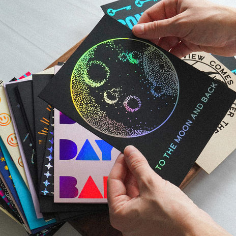
The brand’s signature touch is foil-printing. Being a new medium for me, foil-printing presented a unique challenge in both design and product photography. Foil prints require B&W source graphics and specific line/type weight. A stripped-back approach allowed me to focus on the core aspects of design and then use color as a post-design expression. The resulting designs were crisp, bold, and versatile.
Site Design:
Homepage + Sales Funnel
Relying on my marketing experience, I built the homepage funnel before designing the new brand kit. I researched similar direct-to-consumer brands and created a revved-up funnel that specifically targeted customer hesitations and concerns. By the end of the funnel, objections are erased, intrigue is piqued, and the UX is pleasant and informative.

Site Design:
Collections
Another section of the new site, the Collections page serves as a menu that serves hungry customers samples of each of the brand’s featured products. I relied again on a mid-century aesthetic with playful lines to guide the viewer from one pane to the next.

Product Photography
To accurately showcase the brilliance of the foil in these greeting cards, the set design and photography had to be uniquely crafted. I experimented with both natural and artificial light sources to illuminate the foil. Head on shooting resulted in bland images, so innovative angles, textures, and spatial depth were utilized. The results were unique and totally in line with the brand’s aesthetic.
Product Packaging
Designing product packaging was a first for me. And as part of Midnight Letter’s rebranding, it had to be spot-on. I aimed to be very Occam’s Razor with the design; what was the simplest, most effective solution? Branded paper bands with color-matched logos. Aligned with the brand’s mission, there was zero-plastic, and every component is 100% recyclable.
Reflection
This project allowed me to showcase my capabilities as a full-stack designer by executing web and graphic design, product photography, packaging design, and social media and marketing strategy. After thoroughly discussing the company’s objectives, I delivered a cohesive and visually compelling brand identity across various platforms. Through this process, I learned the importance of consistent branding, the impact of high-quality visuals on consumer perception, and the value of a strategic approach to social media marketing. This project solidified my expertise in creating integrated design solutions that elevate brand presence and engagement.


